COVID-19 Mortality Update - October 2020
The Chart
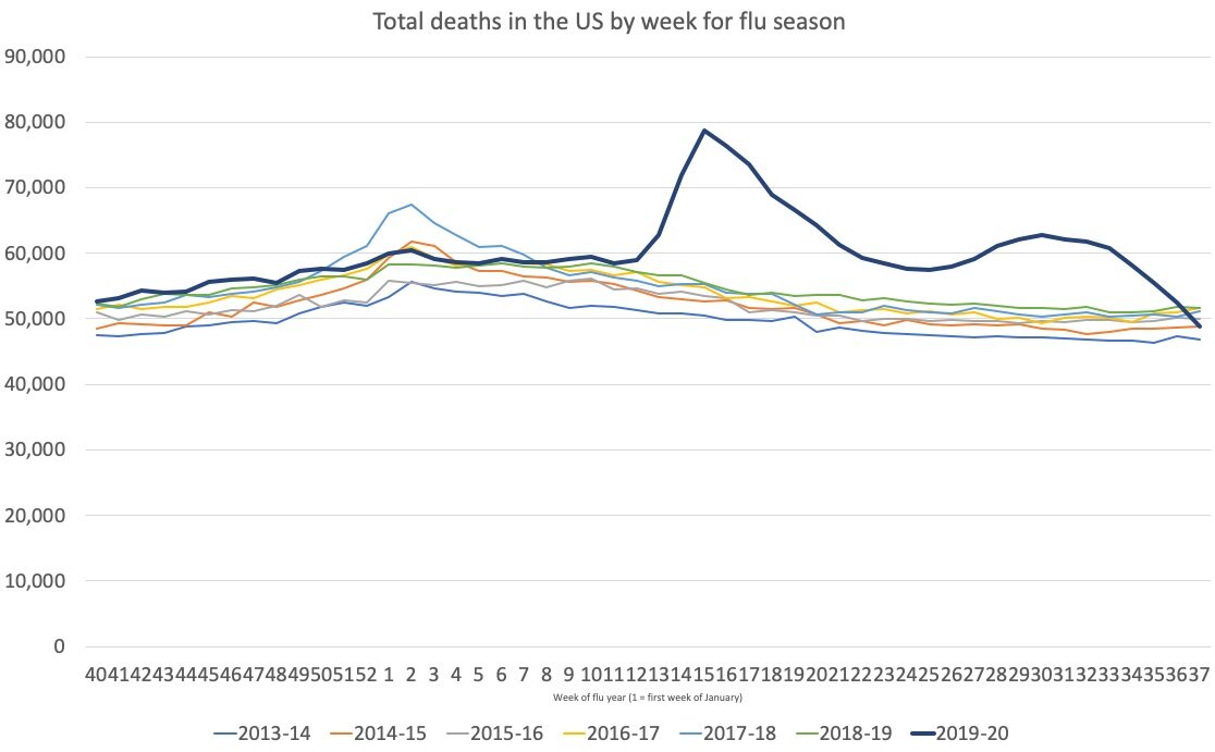
This chart compares the total number of people who have died from ANY cause for this and the previous six years using data from the CDC. The X-axis is the week of the year. (Week 1 ended January 4, 2020; Week 11 ended March 7, 2020, Week 33 ended August 15). There is no doctoring these numbers as it is all deaths for ALL causes.
Note: I choose to display beginning at week 11 because before that the data was in alignment with the previous years. For those curious, the full chart is at the bottom of this post.

My thoughts
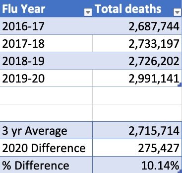
COVID-19 is still killing 10 to 15 percent MORE people than would have otherwise died in an average year. So definitely NOT the flu.
The spike in weeks 13-20 was due mostly to the medical profession learning how best to treat the disease. It was a BAD idea to put recovering patients in elder care facilities. It was a BAD idea to intubate based on low O2 levels alone.
Although the CDC says that their data is ~100 percent complete, the total number continues to rise by sometimes more than 2 percent from week to week. I would say that this data is very solid through week 33 (week ending August 15) as indicated on the chart.